
BRAND IDENTITY
Brand identity must inspire trust with consumers, customers, and invite you to know who you are. As a creator I need to understand the brand’s culture, character, and personality, as well as the products and services offered.


Client: Urban Air Trampoline Park — Brand development
The Challenge: This was a new company that only had one location. The goal was to create a brand look that was bright and fun to attract young clients. The branding I created raised the bar for Urban Air and supported its expansion strategy. They have since franchised over 230 locations.
Category: Branding, Design, Print

Client: Sloan & Williams Winery — Logo development and five wine labels
The Challenge: Business partners and boyhood friends, this client wanted a label that would tell the story behind their wine. With rough edges and overlapping S and W, it shows their Texas roos, ex-military career, and partnership.
Client was a new winery and wanted labels to tell the story behind the wine and location of grapes used. The logo design needed to reflect the partnership between the two boyhood friends, this is why the S and W overlap, owners are ex-military so they preferred a Texas, rough edge to the logo. The logo is used on labels and winery location signage.
Category: Logo, Design, Print


Client: Grapevine Heritage Foundation — “New Membership Brand Campaign” for a non profit organization
The Challenge: I created a new branding campaign for a non-profit that can be used for 4-5 years and can expand through time and across multiple events. The client goal was to have a fresh clean design to attract younger demographics and family oriented audiences. The goal of messaging was to create a sense of ownership in the community through quality contributions. Two-color printing made the campaign cost-effective to print, buy ads, and mail more collateral for a greater exposure.
Category: Brand Development, Design, Marketing, Print


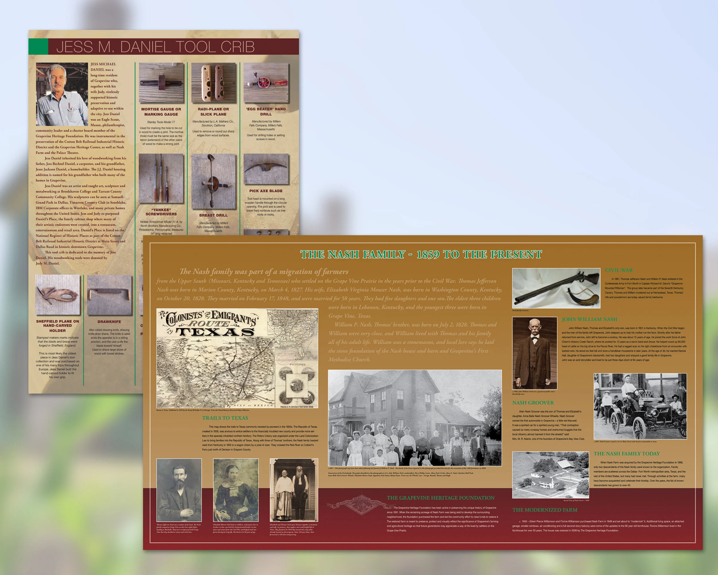
Client: Nash Farm — Complete branding and development
The Challenge: This client wanted to develop a total branding package which reflected the farm’s heritage. The branding carried throughout the many events and educational programs hosted at the farm. I developed the new logo, which was the jumping off point. After that, I developed numerous other print materials including self-guiding brochures the size of a road map, large museum-like panels inside the farmhouse, and wayfinding signs. The new branding will be used for future retail sales such as t-shirts, garden bags, and, yes, a branding iron!
Category: Branding, Logo Development, Print, Wayfinding Signage, Exhibit Panels, Digital
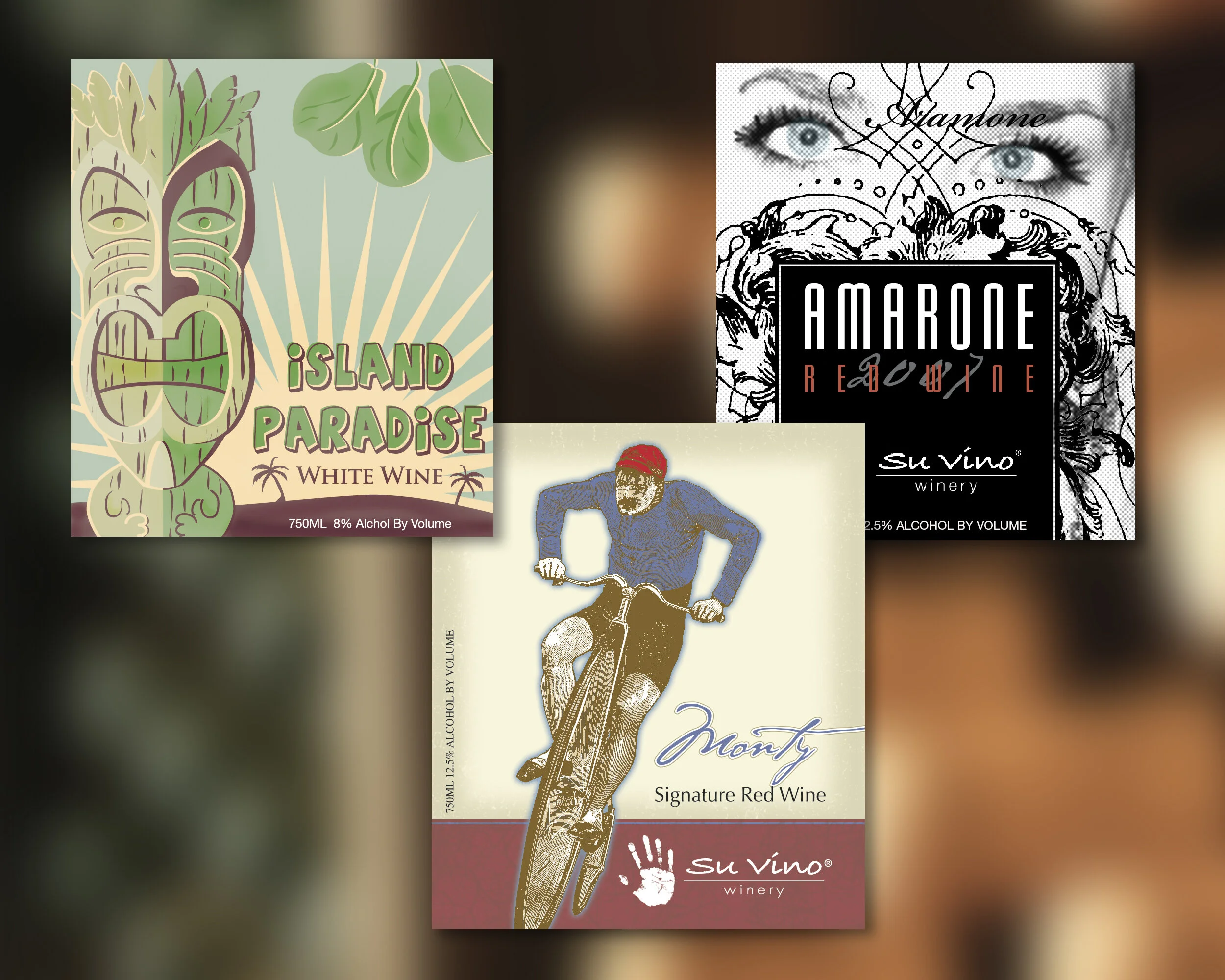

Client: Su Vino Winery — Design two wine labels
The Challenge: Each label needed to give a feeling for the wine. Island Paradise is a sweet white fruity, light and summer tasting wine. The Monty used vintage heritage grapes from Italy to make an earthy red wine. Ad design layout was used in multiple formats such as a postcards, digital banner and ad formats.
Category: Marketing, Design, Labels, Print


Client: Promotional Products Association International — “Ready. Set. Launch.”, marketing Expo campaign
The Challenge: After 25 years PPAI had outgrown the Dallas Convention Center and was moving it’s established Expo to Las Vegas. The campaign needed to encourage distributors and suppliers to sign-up for the move. Beginning with a new name and logo, capturing the energy and this show was “The Expo” for the industry. The concept for this campaign was aimed at the unlimited potential of Las Vegas, and is achieved through dramatic photographic imagery.
Category: Marketing, Design, Print

Client: i Fratelli Restaurant — Design two wine labels
The Challenge: As an established restaurant with multiple locations, this client decided to sell their own red and white in-house wine. The client wanted the label to reflect the new art deco style and the Italian glass mosaic that appears in newly remodeled restaurants. The label turned out gorgeous. Labels popped off the bottle with the sparkle of the foil and die-cut front and back labels. Far right —Samples of other label designs.
Category: Design, Labels